c_studio
Creative Direction + Art Direction + Design + Brand System & IDENTITY

c_studio is an inclusive and pro-diverse creative agency whose mission is to provide an alternative to the exploitive and exhausting work practices of the industry and the lack-luster output that results from it. To reflect these ideas of a paradigm shift to a new system of production - I worked with the cofounders on a brand name that would have an “openness” to invite interpretation and suggest a collaborative space.
I explored concepts of “blank space”, “building blocks” and “collaboration” to achieve the final “c_studio” logo and abbreviated “c_” mark. The solo underscore mark itself plays freely within the design system transforming into a blinking cursor, a bullet point, or an abstract repeating pattern.

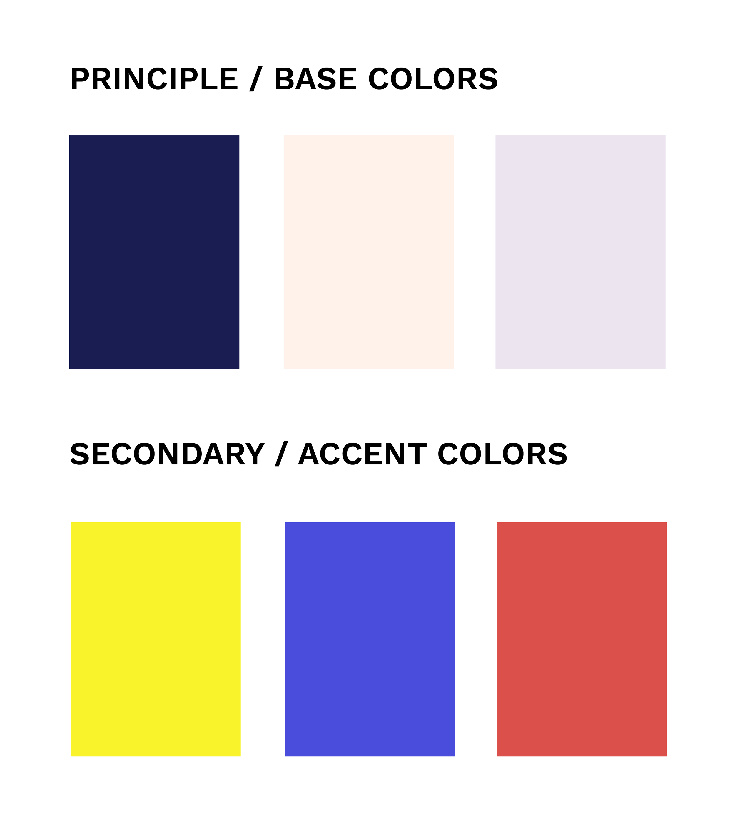
For the color palette and supporting fonts the challenge was to embody a modern and sophisticated feeling while also being bold, eye-catching. The font “Space Mono” perfectly rides the line between a business-ready professional agency and a cutting-edge “digital first” design studio.

the main info graphics and illustrations for c_studio are comprised of simplified lines and shapes that convey motion and ideas clearly.


